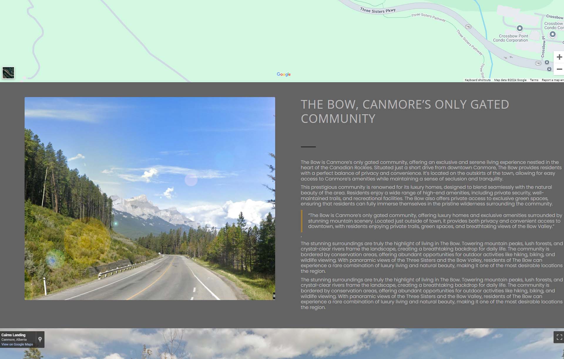
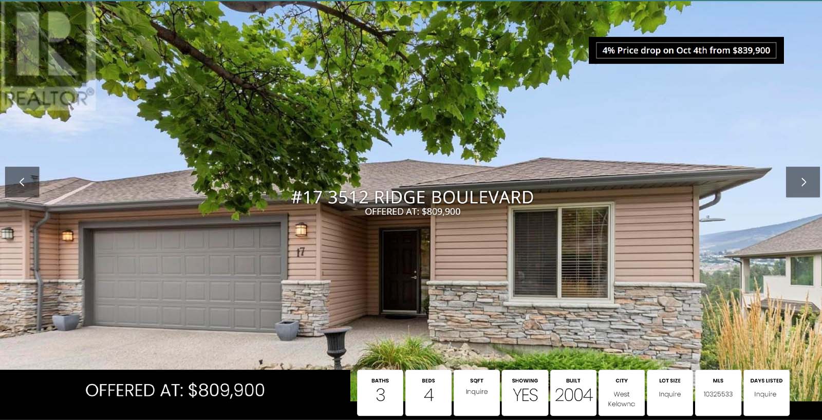
Transform every property into a must see!
EstateVue Immersive Listings are the newest kid on the block. But this isn't your average shiny squirrel. Immersive Listings by EstateVue take an old idea and turn it into a lead generation machine that benefits listings agents for as long as they choose to stay in business. Start building your immersive listings portfolio today and watch your listings explode and the leads start to roll in! Click the button to learn more about the newest advancements in single page property websites!
As a professional working in the real estate industry, having a great website is an essential part of your marketing strategy. Whether you are a broker or an agent, having a digital place for potential and current clients to explore listings and learn more about you is paramount. However, simply having a website is often not enough to set you apart from your competitors. Instead, to truly differentiate yourself, your website must include strong design elements and features that elevate your brand above others in the industry. To help you get a better understanding of what we mean, this article will be dedicated to showing you how to design an effective landing page for your Canada real estate website.
The Aesthetic Considerations of a Great Real Estate Landing Page
Aesthetics are critical when it comes to designing an effective landing page for your real estate website. Before we continue with how to design an eye-catching landing page, let’s first define what a landing page is.
Landing Page: a standalone page with a single call-to-action that encourages users to do something. For example, in the real estate world, this might be scheduling a free consult, RSVPing for an open house, or signing up for a monthly newsletter. We should also note that landing pages don’t have much (or any) navigation to other parts of your site. In essence, landing pages are where you turn visitors into leads. Or leads into customers.
Now that you understand what a landing page is, how can you make yours stand out? The first thing you need to do is consider the visual hierarchy of your page. This means determining what elements should appear where and in what order. Basically, it’s about drawing the consumers’ attention to the most relevant information first and then guiding them to any secondary elements. For instance, you’ll likely want to have a large heading, or visible call-to-action somewhere noticeable on the page. This text should be the largest on the screen to direct attention there first. Then, you might have a description of the offering or customer testimonials in a smaller font.
If you use any images on your landing page, you’ll want to ensure that they are high quality and relevant to what you are aiming to accomplish with the landing page. Beyond this, ensure that your landing page is consistent with your overall branding. This will help to reinforce who you are as a company and contribute to better brand recognition. Be sure to adhere to your brand guidelines as you develop your landing page.
Performance and Functionality Must-Haves
To ensure your real estate page is truly effective, it’s essential to focus on performance and functionality. Start by keeping navigation super simple and intuitive. Since landing pages are typically focused on one main action, it’s important that any navigation links or buttons are straightforward and minimal. This way, users stay laser-focused on your primary call-to-action without getting distracted.
Another biggie? Page load speed. A slow-loading page is like an open house with a long wait at the door—it’s going to lose people fast. So, aim to keep load times snappy by using optimized images, cutting down on extra files or plugins, and cleaning up any unnecessary code. This keeps visitors on your page longer, which makes it more likely they’ll take action.
Then, there are the essentials: your lead capture form, call-to-action, or contact info. These should be front and center! Make sure the form is quick to fill out, and that the call-to-action is clear and inviting, like “Schedule a Free Consultation” or “Join Our VIP List.” You’re aiming for simple and friendly—not overly salesy. Finally, your contact details should be easy to spot. Clients should never feel like they’re on a scavenger hunt to find your phone number or email.
And let’s talk about SEO for a minute. Local SEO is a game-changer for real estate. By optimizing your landing page for local searches, you’ll be showing up when prospective clients are searching for agents, brokers, or listings in your area. This way, you’re not just attracting visitors—you’re connecting with people who are genuinely interested in your market.
Contact us About GETTING A Real Estate LANDING PAGE FOR LISTINGS MADE IN Canada
For more information on designing effective landing pages for your Canada real estate website, contact us today. We’d be happy to help you as you work toward establishing your business in the real estate industry. Be sure to check back next month for more content like this! We look forward to working with you in the near future.


 Mon-Fri: 8:30-5:00
 #7 3185 Via Centrale, Kelowna BC


